

Please, indulge my pleasure for interior design. Here, I have taken a very Victorian room and turned it into a mid-century modern space.
With interior design, the principles generally stay the same regardless of the period in history. In fact, the dictums of the use of symmetry, asymmetry, color, spatial arrangements, and any other principle persist in interior design just as they do in the arts.
Elements in Victorian design includes ornate fabrics and wallpapers. Brocades and floral were very popular because of the availability of such rich materials due to the new industrial technologies that could mass produce fabrics and papers relatively cheaply.

One thing one will notice in going through these pictures of the Victorian room is how “busy” the room is. Minimalism was not a consideration during these times. The Victorian interior designer filled rooms with objects made abundant by the extensive trade between western nations and the opening of the East. People at the time considered this conspicuous display as appropriate for the modern family.
Another consideration during the Victorian era came from the proliferation of goods from the past and from the different continents. The Victorians were eclectic. They gathered in objects and ideas from eastern nations such as China and Japan and found room for objects from the Georgian, Napoleonic, and Baroque periods in domestic art history while supporting the Arts and Crafts and other contemporary movements. Companies like William Morris and Tiffany’s thrived during this time. Many concepts blended in the Victorian room such as Gothic Revival, Greek Revival, and even Chinese and Japanese pieces. Below one will see this eclectic nature in a painting of Rossetti’s drawing-room.
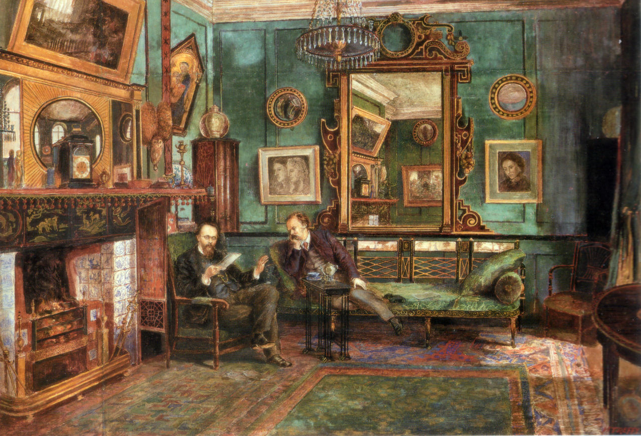

The concept of what one sees in the above picture is a seating area specifically designed to cluster around the central feature of the room, the mantelpiece. The sofa is Edwardian. The two side tables are Queen Ann like the two chairs. The jar at the front of the picture is a Chinese storage jar. The vases on the mantel come from France. The two braziers on either side of the mantel are Romanesque. The brass urn in the corner is Greek Revival. These objects all combine to balance the room symmetrically around the fireplace.
Nevertheless, since this is a big room, I have chosen zones each having its own characteristics. This is an interior design practice useful for modern design as well.

The strong red brocade wallpaper dominates the colors in this room. The floor to ceiling drapes with the stark white inserts breaks up the repeating pattern and dramatically frames the windows and the French Empire tables. A large central Persian or Chinese carpet on the floor was not uncommon and helped provide a cohesive element to a room.

On this side of the room, we see dominating this wall a large Chinese wedding cabinet and above a Chinese fan. Due to the number of pieces on the other side of the room, this heavy presence furnishes a balance. This was almost a necessity considering that due to the two windows, this side of the room only had one clear wall in which to place furniture. We also get a better look at the French Empire tables.


Here we see another zone within the room, one less formal.


We have another zone with a Victorian sofa and a red Chinese ceramic side table.


If we have paid attention to some of the details in this Victorian room, we will notice in the modern that some of the objects fit perfectly fine among mid-century design.

Notice, no more stained wood moldings as baseboards, around windows, or crown molding around the ceiling. The fireplace is now a shiny white, while the walls have taken on a pale yellow color. Also, the Queen Ann chairs have been retained. Instead of heavy drapery, the windows are exposed up top and the cloth is a semi-shear fabric. Due to the height of the ceiling, paintings are large, using bright colors and contrasting neutrals like black and white. These colors unify in their use around the room.


The modern room mimics the Victorian room with similar zones. Here, we have a seating area with mid-century furniture and gooseneck lamps. The picture in front is by our humble author and the one to the left is by Kazamir Malevich.


Instead of a lounging area as in the Victorian room, we have a credenza and a few objects. The painting on the wall is by David Hockney.

This side is deliberately sparse compared to the lateral corner. With the predominance of white and orange, the accumulation of windows, and more space, not only is a zone created, but actually balances with the other side. Also, to further anchor the central seating area, a white rug contains the furniture in front of the fireplace and contrasts sharply with the deep red-painted floor, while two circular red rugs blend in on both sides emphasizing the separate zones.

Even though Victorian and modern styles embrace the eclectic, the two diverge obviously in terms of space and decoration. Modern seeks a simple serenity. Victorian absorbs curves in abundance and enjoys an organized clutter. Instead of the subdued or controlled colors of the Victorian room, modernist design of the modern room strips things down to the basic and evokes light and basic colors. The major emphasis in the modern room is less decoration, less elaboration. The modern room can use some of the same objects as the Victorian as long as they do not overcome or distract too much from the clean lines and basic geometry. A gilded, brocaded wing chair might be out-of-place, for instance. At any rate, in converting a Victorian to modern, subtraction always helps. In our case, choosing the right furniture, decorations, and artwork to begin with brought us a good distance toward having a modern room.
HBosler

You must log in to post a comment.